Dear potential vendors: Hiding your price lists…

Dear potential vendors: Hiding your price list from me doesn’t make it more likely that I’ll buy. It does risk wasting your time, and mine.

<span class="entry-utility-prep entry-utility-prep-cat-links">Posted in</span> Uncategorized | Leave a comment

Service Desk personnel don’t get enough

Service Desk personnel don’t get enough love. http://ow.ly/ieAcA

<span class="entry-utility-prep entry-utility-prep-cat-links">Posted in</span> Uncategorized | Leave a comment

My week with a Microsoft Surface RT

I write this blog post with a heavy heart.  After such a long hiatus from blogging, I was hoping to write a post about the glories of the latest technology to end up in my lap.  Unfortunately, it is not to be.

A week ago, my wonderful wife allowed me to convince her that I *needed* a Microsoft Surface RT (yes the full name is longer, but I don’t care).  After a quick trip to Best Buy, we brought home the new bundle of joy and began the process of getting acquainted.

From the start there was something a bit off: The Surface RT was a bit big and unwieldy, but I chose to not hold that against it, as I use an iPad Mini on a daily basis, and I find that even my wife’s iPad 2 is a bit chunkified these days.  So I decided that I would make sure that I wouldn’t let size be a factor that skewed my impressions.  One thing about the form factor though : the screen ratio is such that holding it vertically feels almost comical, whereas on the iPad switching back and forth between landscape and portrait is a natural thing to do.

Please note: Many of the negatives I list below are application related.  While one or two bad apps can be written off as, well, bad apps, the fact that so many apps behaved badly (not just the ones I whine about below), there’s clearly a bigger problem at play.

Having said that, in no particular order, here are some thoughts I had about the experience (this is mostly about the software and ecosystem):

On the plus side:

1 – The split screen feature, where two apps can share the screen is straight out fantastic.  Early today while doing some online training, I kept Skype open and docked on the leftmost side, with Evernote taking up the rest of the screen.

2 – The video conference in Skype worked fine, even when docked on the left. Slick.  Video was not the highest quality, but I’m not producing a National Geographic documentary over here

3 – Being able to plug in a USB keyboard when I needed to enter text quickly was a plus.  While I had the Touch Cover for data entry, I wasn’t nearly fast enough on it at the moment that I needed to add notes quickly.  I don’t blame the Touch Cover for that, it’s not a high volume keyboarding device. If I were to be keeping the Surface RT, I’d get the Type Cover and no doubt be very happy.  Of course since I was in a rush and didn’t plan ahead, I used a keyboard that’s about 5x the size of the Surface RT.

Which brings us to the minus side:

1 – It’s too big (Ha! Didn’t see that coming, did you?)  Now to be fair, I only say this as I found that the on screen keyboard was awkward to use, even in the split “thumb typing” mode.

2 – Apps open slowly, all too often.  I don’t mind so much if apps take a few seconds to load.  It even happens on the iPad.  However, it’s not just the first time loading, but the frequent “reload from scratch” that seems to happen.  On the iPad, apps get put into storage and taken back out and resuscitated almost instantly.  An app that you haven’t used for hours or days will zoom right back to life.  On the Surface RT, it is shocking how quickly apps get killed.  A perfect example is while using Skype, I switched between a bunch of apps, spent some time in one of them, and when I went to go back into Skype, it had to sign back in and repopulate everything…  Clearly the device is memory constrained if you use any of the included Office apps (I had PowerPoint open at the time with a fairly small deck loaded) but even without using desktop apps, frequent complete reloads are common.

3 – Speaking of Skype…  What a mess.  Aside from the item mentioned above, I found that messages would actually arrive out of sequence.  Amazingly, a friend and I were “chatting” online, and he would respond to something that I wrote, and it would end up *above* my message, instead of below.  I also found that sometimes a notification would come in (while the app was in the background) and when I switched to it, the actual message wouldn’t arrive for “quite” a while.  I also had it lock up several times, forcing me to learn how to kill a running Metro, Modern, Windows Store, whatever it’s called, App.

4 – Email randomly reloading.  I would open email, it would refresh and show me my messages – slower than the iPad but not horrible.  Just about the time I’d try to take an action on one of them, the list of messages would refresh again, leaving me in limbo.  These secondary refreshes would take a “long” time, probably around 10 seconds of just sitting there seeming to do nothing.  Several times, after deleting many emails, the list would refresh and those emails would re-appear.  This is pretty scary.

5 – The keyboard cover really seems necessary.  There were a couple of instances where when trying to use the on screen keyboard, the field I was trying to type into was completely obscured by the keyboard.  On the iPad this usually resolves itself with the field moving into view.  It worked most times on the RT, but not always.  This isn’t really a hugely negative thing, but can be a drag.  Unless you don’t have the keyboard, in which case you’re screwed.

6 – Apps seem just too slow.  It would take quite a while for data to come in, whether it’s the Weather app, the WSJ app, or Evernote, everything seemed to move pretty slowly.  Perhaps the ARM hardware can’t keep up?  Maybe the network stack is slow?  Here’s a perfect example.  I just woke up the Surface RT, clicked on the WSJ app, and it took 18-20 seconds for it to open and populate.  Most of that time was spent looking at the splash screen and the chasing dots.  For comparison, I killed the app on my iPad Mini, re-opened it and it took 1.5 seconds.  (Imagine a few minutes time passing at this point as I wrote other parts of this post…) I just flipped through a few apps, then ended up back at the WSJ and it did the entire reload again.  15 seconds is an *eternity*.  I think this points to memory constraints.  Again probably due to having some apps open on the desktop.

7 – Apps locked up too often.  Evernote died and popped up an error… The WSJ app locked up… Skype locked up…  Windows update locked up.

8 – When I first unboxed it, I went through the patching process.  That took about two hours.  That’s just nuts.  This is (in theory) a tablet, not a PC.

9 – Evernote – aside from the lockups, any time I simply opened and closed a note, it marked it as updated, bringing it to the top of my notes (I sort by most recently updated so the Notes I’m working on are handy). It also locked up, and it was simply way too slow to open.  It would refresh the notes, then blank them out and refresh them again. Sounds familiar, eh?

10 – The live tiles screens are nice and informative, but sometimes, too much going on is just too much going on.  I found myself struggling to find particular apps as they never looked the same.  To find the WSJ app, I would have to scan the screen to find the one with pictures, that had a small bit of text on the bottom left with the WSJ logo on it. Even the much vaunted “semantic zoom” really didn’t work.  Basically there are two icon sizes – big and tiny. 

You’ll notice that I’m not wailing about the angle of the screen with the kickstand, or the seemingly low resolution of the screen – these are all fairly well documented issues covered by many others and I was totally fine with accepting them.

There is just so much potential here that it breaks my heart that it’s just not good enough.  I think perhaps with another revision of the hardware and some more maturing of the entire software stack, they could really be on to something.  The real killer is that if it weren’t for the existence of the iPad, this would be a pretty kick ass device.  Yes, the iPad is just a glorified iPod Touch, and the main screen is a boring list of icons that don’t inform much, but it is fast, and supported by an enormous ecosystem of software and accessories.  I really want the Surface family of products to succeed, and even more importantly the Windows 8 gamble that Microsoft has taken, but right now, it’s just not ready for prime time.

As I told my wife last night as I was boxing it up – I feel okay about the Surface RT, but if someone tried to take it away from me, I wouldn’t care.  On the other hand, if you tried to take my iPad Mini away from me I would fight kicking and screaming.

Let the flames begin!

<span class="entry-utility-prep entry-utility-prep-cat-links">Posted in</span> Uncategorized | 2 Comments

Way to go Microsoft!


Of course, it works fine on Chrome on the Mac…

Image

<span class="entry-utility-prep entry-utility-prep-cat-links">Posted in</span> Uncategorized | Leave a comment

My thoughts on the Lumia 900

For a few weeks, I gave up my iPhone 4S and used a Lumia 900.  Overall, the experience was pretty good, but not good enough to keep me away from the iPhone.

On the positive side, the big screen is a real beauty.  The email application worked pretty well, and the animations were well done.  The size and shape of the phone itself was pretty good.  I figured that over time, the outline of the Lumia would replace the outline of the iPhone that seems to have ingrained itself into all of my jeans.  Syncing to a Mac was shockingly easy.

However, after the first few days, the shortcomings of the device and the Microsoft Phone operating system started to become too glaring to ignore.  Here they are in no particular order:

  • When you have headphones plugged in, but no music playing (or no call going), the normal system sounds play through the phone itself, rather than through the headphones.  This means that if you are wearing headphones that insulate your ears pretty well, and the music stops or you just want some quiet time, the other system sounds (like email being received) will blast out through the phone speaker, and not through the headphones.
  • There are no different volume settings for speaker versus headset.  On the iPhone, when you are listening to music (or more likely in my case, a podcast) through the headphones, you can adjust the volume and it only affects the volume for when you are using the headphones.  Once you unplug them, the volume through the phone speaker is where it was at when you last set it.  Plug in the headphones, and the volume changes to the last setting for the headphones.  On the Lumia 900, you had one volume setting.  This means that if you turn up the volume on the phone, so you can hear the ringer, and then you plug in headphones, you might blow your eardrums out (not literally of course… the Lynyrd Skynyrd concert did that for me.  What? WHAT? I can’t hear you!).
  • Frequently, you cannot use the headphones to start the last thing you were listening to when you turn off the device.  On the iPhone, it doesn’t matter how long you’ve been away from it, when you click the button on the headphones, the music (podcast!) resumes.  This is huge for me as I try to listen to podcasts while walking the dog, and those walks are somewhat far apart.  With the Lumia 900, I think it background kills the music app, so if its been more than five minutes since you last listened to it, you must get the phone out, find the app and relaunch it.  As I recall, this was also a problem for giving the system voice commands (you had to wake it up before it would “listen” to the headphone buttons), but I’m not 100% on that one.
  • The positioning of the phone is poor when you have to hold it to your ear.  In the unlikely event that you use the Lumia as a phone (seriously, who uses their smartphones for calls these days?), you have to move the unit very far down on your ear in order to line up the speaker hole with your ear hole.  On the iPhone it just seems much more natural.
  • BlueTooth streaming is inconsistent.  About half the time, I could get the Lumia to stream audio over Bluetooth.  The other half the time, it was a frustrating dance of trying to figure out what incantation I needed to mutter in order to make it work.  And very quickly it resulted in leaving the phone in the drink holder and just turning on satellite radio.  This is not okay as I like to listen to podcasts during my drives.  And given that most of my drives are short, spending 10 minutes dinking around with Bluetooth streaming is just too much.
  • My car doesn’t understand the Lumia 900 (related to the above). Okay, this isn’t the Lumia’s fault, but it does speak to the huge lead that Apple has.  My car understands iPhone just fine.  I plug it into the USB port in the center console and a second or two later, blammo, my podcast picks up where I last left it off, or I can easily change what I’m listening too with the car’s display.  With the Lumia, it didn’t recognize it at all.  Again, I know this isn’t the Lumia’s fault, but *everything* understands the iPhone.  This is huge in a world where sometimes just getting something to work can be a battle, and people are sick of having these technological fights.  I hate to say it, but mosttimes, Apple stuff does just work (the memory in my previous blog posting was not Apple supplied).
  • No mute switch – many phones are guilty of this, and I’m baffled by it.  Having a physical switch to toggle between muted or not is a huge feature.
  • The camera wasn’t nearly as good as the iPhone 4S’

There were a few more things I could write about, but to be honest, they don’t matter.  What brought me back to the arms of the iPhone was the fact that Apple got all of the little details right.  These are the things that eliminate friction in our lives and the way we use our gadgets.  I think this is why Apple has been so successful over the past 10 years.  Their products don’t do everything that their competitors products do, but they usually do it much more smoothly and more consistently.

So, I went back to the iPhone fold, and have been listening to my podcasts quite happily (as well as making the occasional phone call).  The bad news is that I ended up getting a 16 gig unit that we had lying around, since I didn’t want to redo a contract.  And I didn’t want to redo a contract, because the iPhone 5 is right around the corner.  It will be very interesting to see what they come up with this time around.

Thanks for reading!

<span class="entry-utility-prep entry-utility-prep-cat-links">Posted in</span> Uncategorized | Leave a comment

Mac, diagnose thyself!

Over the past few years, our household has turned from a Microsoft Windows centric one, to one that is populated almost entirely by Apple Mac’s, along with iPhones, iPads and Apple TVs.

While over the years, the Macs have proved resilient reliable machines, our experience has not been without problems.

The only one that has been big enough to matter is the one that has affected my personal iMac.  It’s a 27″ monster, with 16 gig of ram, and a 500 gig SSD (not factory standard!).  This machine is super fast with its quad i7 processor and the SSD.  Unfortunately, over the past three months or so it has become unstable.  The symptoms started with random kernel panic’s (think Windows BSOD), and then moved forward to include drive corruption and the machine just failing to wake up.

Troubleshooting a problem like this can be a real bear!  I started with checking the SSD for errors, and it found quite a few.  After repairing those, things stabilized for a while, but then it resumed having problems.  I then thought that it was perhaps an issue with Parallels (which I use to run Windows and various Linux distributions).  I uninstalled and reinstalled Parallels many times, including doing the full uninstall process as documented here.

At this point, I began to run into corruption problems on the drive so bad that it was corrupted beyond a simple repair, and I had to restore the whole system (back up your systems kids!).  Fortunately this was easy to do because of the Time Capsule that we use to back up our desktops and laptops.

I then decided, since most issues seemed to be drive related, to upgrade the firmware on the SSD.  After downloading a bootable image and “burning” it onto a USB stick, I upgraded and the problem was solved!

For a few days. <sigh>

Continuing along the path of thinking that it was a Parallels problem, I downloaded VMWare Fusion.  I tried to migrate the Parallels VMs over to it, but it failed again.  This reinforced the idea that perhaps the problem was with Parallels.

I finally decided to “start over”.  I wiped out the machine, reformatted the drive, and did a clean install of OS X Lion.  Fortunately this was pretty straightforward and only took about 30 minutes, including the time to download it over the Internet.  I started installing applications (leaving out Parallels) and everything remained stable.  Hooray!

Until I installed the FitBit application.  Within minutes, the machine Panic’d again!  Okay, so clearly the FitBit application is the culprit!  I uninstalled it, and four hours later, the machine went down again.

I decided to try to find a way to stress test the SSD to force an error to come up so I could get a replacement.  After some searching around, I discovered the Mac’s have “built in” diagnostics.  The newest ones have it in eprom (or something similar) and you can get to them simply by pressing and holding D (for Diagnostics – those clever Apple people!) at the chime.  Unfortunately, it wasn’t on mine, so I had to figure out how to get into it from a Snow Leopard boot CD (these are what originally shipped with my iMac).  After several false tries, I figured out that it was on disc 2.  So to get the diagnostics to work, I just put in disc 2, rebooted, held down the D key and voilà, a few minutes later I was looking at diagnostics.

Now, let me tell you, these things look like they are from 1985… and I don’t care!  They are obviously written to diagnose a computer, not to have a super looking experience.  Here’s where things get interesting. I don’t have a wired mouse, and it turns out that the wireless one doesn’t work (I had a wired keyboard plugged in at the time, so I can’t say if a wireless would have worked or not – I’m guessing not), so I had to use keyboard shortcuts to navigate the app.  It only took a moment to figure out tab and up and down arrow were my friends.  I tried to check the “thorough” diagnostics flag, but couldn’t make it work, so I figured I would just run the normal ones.  I kicked them off and sat on the couch for a few minutes and… BAM!  An error came up!  Oh happy day!  I can prove that my SSD has a problem and get it replaced!

Wait, hang on a second, this error says “MEM” in it?!

So get this, after spending months thinking my SSD was unreliable, the problems were coming from one of the memory chips!  Son of a…

To make an already way too long story somewhat short, I then had to uncable the iMac, pull out some memory chips, hook it back up (just assume this part happens a lot), run diagnostics again, find no errors, swap the memory chips (using the same slots to make sure I was testing the chips, and not another set of slots and chips), run diagnostics and it repeated the error – consistency!  It is my friend!  Finally, I pull one of the chips out, ran diagnostics, got a clean bill of health, put that chip aside, reinstalled the other ones, ran diagnostics, clean bill of health and…

Five days later it hasn’t had a glitch.  OH HAPPY DAY!

Posted from my now healthy iMac.

<span class="entry-utility-prep entry-utility-prep-cat-links">Posted in</span> Computers and Internet, Mac | 2 Comments

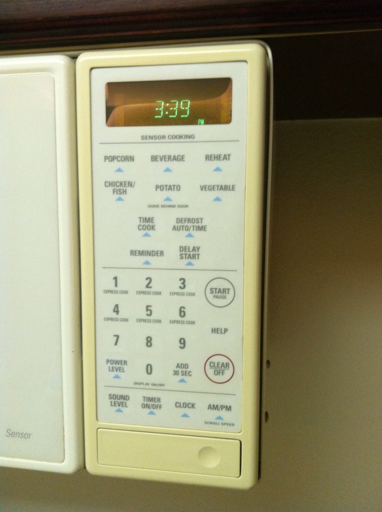
Why did it take it take Apple so long to create white iPhones?

I bet they worked pretty hard at making sure it doesn’t do this as it ages…


<span class="entry-utility-prep entry-utility-prep-cat-links">Posted in</span> Uncategorized | Leave a comment

If my systems failed this much, I’d be out of work…

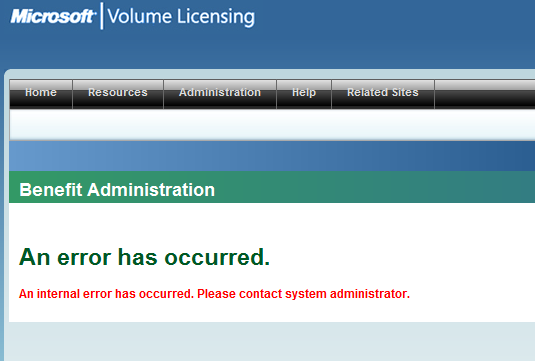
It seems that every time I try to do something on the MSDN volume licensing site, I get a failure message.  If my users failed this often at their jobs due to the systems not working properly, I’d be looking for a job.  Come on Microsoft, this is what you do!  You must make this work well…

MS Site Failing Again

<span class="entry-utility-prep entry-utility-prep-cat-links">Posted in</span> Uncategorized | 2 Comments

Some thoughts on the Kindle Fire

I’ve had the Kindle Fire for over a week now and so far it’s been an interesting experience.

There have been plenty of reviews that do a much better job than I’m willing to do reviewing all of the gory details (take a look at ArsTechnica’s review for a complete run down), but I do have a couple of specific thoughts I’d like to share.

To put this in perspective, my “other” tablet is an iPad 2. I totally get that the Kindle Fire is NOT an iPad, and is not a full fledged tablet, so these comments do take that into account.

First of all, the build quality is definitely a step below what you get with an Apple device. The design is “chunky”, and in my case, if you squeeze the top and bottom of the left side together (such as when gripping it between your finger and thumb), I feel the case flex, and I can even sometimes hear a tiny squeak!

Second, the lack of a built in Exchange email client is a tough pill to swallow. I’ve found an app that handles the job (Touchdown for Android – $20 for a license, 30 day free trial), however it does not work as smoothly as my iPad does. The main issue here is that even though the new email notification chime will go off when a new email arrives, the time it takes to display the email once the device is turned on and the app is opened can sometimes seem like forever. It’s probably “only” a 30 second delay, but that’s compared to no apparent delay at all with the iPad.

Third, the Kindle reading app itself. There is no excuse for something as simple and important as page turning to stutter. Now the good news is that a release that came out between the time I started writing this and now seems to have fixed this. The problem is that it still fails in another major way – reading magazines. I have gone pretty much paperless in my reading life and magazines are one of the things I’m happy to have on my device instead of on a table. The problem isn’t so much that the Kindle Fire screen is too small for reading magazines (most have a button on the screen that lets you switch to a text view that works just fine), it’s just that for many magazines, it completely forgets where you were at the last time you opened that magazine. It’s as if each time you put a magazine down, you don’t bother to put a bookmark in so you can find your spot! Now if you’re reading some fluffy magazine this might not be a big problem, but for things like Technology Review from MIT it is not acceptable to have to keep hunting for where you were last. The funny thing is, the Kindle reader app on the iPad handles this just fine.

Finally, the carousel that shows your most recent apps run / web sites visited / books read is just awful. It is impossible to position correctly, and it’s impossible to hide stuff. For example, if I just finished a book, on the iPad I can just delete it from the Kindle app. On the Kindle Fire, it’s impossible to get rid of it. I’ve read it, I’m done, I don’t want to see it again!

I’m finding overall that the experienced is mixed. What are your thoughts?

<span class="entry-utility-prep entry-utility-prep-cat-links">Posted in</span> Computers and Internet | <span class="entry-utility-prep entry-utility-prep-tag-links">Tagged</span> , | 2 Comments

New tools = new frustration

My post from yesterday was inadvertently configured with no commenting allowed. I’ve fixed the setting in the posting tool I’m using, and fixed the post itself. Sorry about that!

<span class="entry-utility-prep entry-utility-prep-cat-links">Posted in</span> Computers and Internet | Leave a comment